1st November 2010 ::

I was complaining about Windows activation in the previous post. Oh, but if only that were the only software encumbered by activation. More and more commercial software is going this way; this saddens me. It's hard enough getting software to work at the best of times, without artificial barriers on top.

Yes, I'm still refusing to use Steam. Call it paranoia (go on! You would call it that! You are one of Them after all!), but when I buy something I want to be really buying something, and not renting the ability to ask for permission to use it.

At least with Steam it's only frivolous games you lose when something goes wrong. But now even the hardware's getting locked down: the popularity of closed operating environments like Apple's iOS really scares me. After the long hard work the free-software and open-source folks have put into chipping out a sliver of freedom, we're so ready to hand over unprecedented control of our computing activities to Apple, a company whose corporate interests may not (almost certainly don't) align with our personal aims.

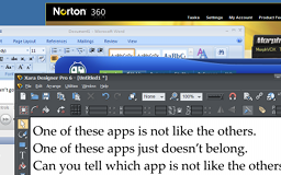
Whilst I can happily ignore most activation-encumbered commercial software, it's especially depressing to see my old favourite graphics application Xara Xtreme fall prey to this unwelcome feature. I've been using this for years—decades, if you count its RISC OS predecessor ArtWorks—but I shall not be upgrading to the new version 6. It was bad enough with the weak Magix-imposed key-disc protection on the CD in version 5 (getting it to work on a virtual machine was a pain), but activation is the last straw. And whilst Microsoft and Steam probably aren't going to go bust or just abandon their activation servers in the medium-term, I'm (sadly) not so confident about Xara. (Indeed, I remember its rival vector graphics app Cerilica Vantage, and the misery of that app's activation fiasco.)

Anyway it's not really that hard a principled stand to take, because the new features in v6 are pretty uninteresting to me. Xtreme's vector graphics abilities have been largely unchanged for several major versions now. They still haven't fixed the problems with the most important, basic part of a vector app: the Path tool... or even the silly, trivial drag-handles bug in the Selector that's been there since version 3.2.

Using vectors for transparency sounds like a great new feature, except then it turns out you can only use them for transparency on bitmaps, which is just bizarre (and in practice doesn't give you any effects you couldn't do before). Previously, the joy of Xara was the way you could combine all of the tools to work out creative effects of your own; you could perfectly well have an object with transparency and a shadow, and a contour. On an element in a perspective. In a clipview. Or whatever. Now it seems the new features (like this and version 5's Object Masking) are bags-on-the-side that don't integrate well with the rest of the feature set.

Instead, where all the real action's happening in the photo editing area (not really my focus) and the web page export.

OK, the web page export's fine for UI prototyping. But it's absolutely horrible for creating actual full web-sites, and Xara are now encouraging its use for this inappropriate task. Yet as a WYSIWYG tool there are insurmountable accessibility problems with almost everything it produces, and it's utterly impractical to maintain/update multi-page content sites in what is still the interface of a vector graphics application.

Unfortunately Xara seem to have decided this one feature is the growth engine and invested endless development effort into making more and more web features (that would be trivial to do in simple HTML in a text editor) into obscure, unmaintainable hacks in the editor interface, to satisfy the new generation of users, who judging by the forums are largely web authors who don't really understand how the web works at all.

An FTP client? In my vector graphics drawing app? It's more likely than I thought.

Oh, and to add insult to injury, they've just skinned the UI, to make it all dark. Because ‘professional’ media apps have to be dark, right? It makes them go faster, due to ambient... reflection... tachonometry... sciencey... science.

Please, application authors, leave the skin alone. Use the native OS widgets. If I want a dark theme let me choose a dark theme in the OS and have all the applications respond accordingly. Don't force your questionable artistic taste onto the dialogs and chrome I have to use on a desktop that looks nothing like it. Sure, it makes your application “stand out”. The usual similie for that expression is “like a sore thumb” and it's not considered positive. It only takes a few anti-social self-important skinned applications to turn the desktop into a horrific inconsistent eyesore (left).

So, that's that. Goodbye Xara. I'll miss you. You helped me make a lot of silly pictures, and your clever effects helped me hide a lack of artistic talent. I've had a longer relationship with you than any text editor, operating system or even programming language. Or person, of course. But people are fickle and ephemeral compared to software.

I'll always remember the good times. And, yeah, I'll carry on using Xtreme 5 in the meantime, until I can fully migrate to Inkscape. It may have an inconvenient interface and missing features, but it's free instead of copy-crippled; it works with standard SVG files that people can actually do something with; and above all it has a name far less stupid than “Xtreme”. (Seriously, whose idea was that? c'mon)

Television is all made by a shadowy cabal you know ::

Yeah, I do enjoy my paranoia. And it's Halloween, a perfect time to be paranoid. Well, it would be, except it's gone way past midnight since I started typing, so that doesn't really work any more. Let's say All Saints' Day is also appropriate for paranoia, for some unspecified reason.

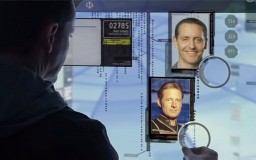
Either way, it's been a great year for TV paranoid fantasy. That's a genre I've just made up, which basically means TV shows that are ripping off The Prisoner. Shows where a powerful Conspiracy (Them) captures and tries to control the Everyman Protagonist, Played By White Male Actor, either called John, or given a punny Meaningful Name. Strangely TV Tropes don't seem to have filed, stamped, indexed, briefed, debriefed and numbered this genre yet.

These shows are effective because they play on our sneaking paranoid suspicion that our lives are fictions, driven deliberately by forces beyond our control, victimising us in order to frustrate and humiliate. (Only in my case is this really happening; you just think that, because you're nuts.)

Actually I'm a bit surprised that there has been so much paranoid fantasy over the last year: much as I enjoy it, the shows rarely do very well and never get a second series. Having delivered an initial dose of fun psychosis and Weird Shit, they typically struggle to come up with some further reason to exist, like being some kind of Allegory For Like Society Or Something.

They then almost invariably have a Terrible Ending, as the writers struggle to come up with some sort of rational explanation for why the Conspiracy spent such inordinate effort and money to confound and victimise Everyman Protagist who is evidently so inhumanly enduring and noble that he'll never break... when he could more practically have been dealt with by means of a liberal application of murder in episode one.

The archetypical plot for an episode of a paranoid fantasy series is that Everyman Protagonist befriends Pretty Lady, they work together against Them, appear to be successful, then just as they appear to have freed themselves from the clutches of Them, Pretty Lady turns out to have been working for Them all along, and the whole foiled escape was a clever (if implausibly complex) ruse to break Everyman Protagist's will. Oh no! I never saw that coming. That horrible Pretty Lady! See, I was right not to trust women! I'll never break! I'm too tough and righteous! Take that, evil women! I will never be duped by your sinister feminine machinations!

[sob] i'm so lonely

The Prisoner (1967) ::

A retired spy abducted and kept in a pretty, comfortable but strange seaside village full of odd people, and is really very cross about the whole thing. The Prisoner is the original paranoid fantasy show. And still the best? Maybe. Certainly the outright weirdest, with its own distinctive look and jarring editing adding to the already bizarre content.

Everyman Protagonist: creator-writer-director-actor Patrick McGoohan, in excellent fulminating form as Number Six. McGoohan could deliver the most banal lines with an angry or sarcastic snarl. It was never quote clear how much of McGoohan's Six was actually acting. And, let's face it, Number Six was a bit of a dick sometimes. I know I can't say that because he's the righteous individualistic hero and that, but if you tried taking Six's strop-throwing out of the Allegory For Like Society Or Something in behaving like that in actual society all the time, one might take you for a sociopath. Or is it just that I'm just turning into a horrible authoritarian as I get old?

John or Meaningful Name? John. Assuming you accept the popular theory that Number Six is the resigned John Drake from Danger Man.

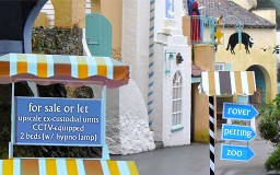
The Village: is The Village. Well, it is the trope namer. Being filmed in Portmeirion contributed a huge amount to the weird atmosphere of the show, as was clear from the later, more cheaply-filmed episodes which featured only minimal, glaringly-recycled location footage.

Adding to the location's distinctiveness, the show had weird design everywhere. The clothes, the sets, the music choices, the iconography, even its own typeface, contributing to giving the Village an evocative sense of place uniquely of its own. Add in the weirdness of the bizarre murderous weather-balloon guardian Rover, mute midget butlers, cordless phones (what devilry is this?) and pervasive surveillance cameras... this was weird shit back in the 60s, y'know?

Now of course the UK's ubiquitous CCTV monitoring and internet, handy and ANPR car tracking make the Village's once-horrifyingly-sinister collection of cameras built into flashing statue eyes seem positively quaint.

Them: ambiguous, but probably the British Government. Possibly with other Western allies, but definitely with us in charge judging by all the British actors. Could the UK have run a high-tech operation as involved as expensive as the Village on its own?

Not today, of course. With spending cuts we'd have to sell the Village to property developers, have the Villagers simply tortured to death in an Iraqi prison (why did Number Two never think of this? So much easier for everyone), and put the surveillance observers on the dole. In the spirit of cost-reduction and the Big Society, we could simply have citizens oppress themselves through peer-to-peer surveillance. Oh! I forgot, we're already doing that.

Pretty Lady episodes: The Chimes of Big Ben, and kind of Free For All and Many Happy Returns as well. All pulled the exact same stunt of having the apparently-friendly Lady turn out to be the new Number Two. That got old fast.

Terrible Ending: Man, That Ending. We can give it points for audacity now, in its stubborn refusal to provide any answers. Instead it dove head-first into the surreality of the show and never surfaced. And we can give it points for being less conventionally-bad than the endings of many shows today. (Battlestar Galactica, anyone?)

But then, the traditional function of an ending was expected to be some kind of wrapping-up of narrative threads, not a load of wilful confusingness that refused to address any aspect of the show other than the Allegory For Like Society Or Something. No-one was pleased.

Second Series? Hah! After that? No. ...Thankfully, given that McGoohan had clearly run out of ideas some time before the ending, resulting in a run of largely horrible random filler that didn't even bother stick to the concept of the series.

Nowhere Man (1995) ::

Were there no Prisoner rip-offs in the seventies or eighties? Really? I can't think of any, but unborn and small-child version of myself probably wouldn't have known about them at the time. Small-child version of myself was rubbish.

There was the X-Files before this I suppose, but whilst the X-Files's conspiracy elements surely inspired the commissioning of Nowhere Man, the paranoid stuff isn't really at the heart of X-Files, so it doesn't really count by itself, according to our panel of judges. Sorry, the X-Files... please do not call our panel of judges a conspiracy. They're really very nice.

Nowhere Man's Prisoner pilfering was particularly evident in several episode plots, and explicitly acknowledged by creator Lawrence Herzog. Co-producer Joel Surnow you've probably heard of, as he'd go on to create 24... a show with a quite different attitude to whether it was a good thing for a secret government organisation to infringe on one's civil liberties.

Everyman Protagonist: A photographer takes a picture of some military naughtiness, as you do, and gets erased—everyone he knew claiming not to know him—as a result. The “why did you resign?” macguffin becomes “where are the negatives?”.

John or Meaningful Name? Meaningful Name. Veil, like a veil, hiding something! A-ha ha.

Them: A non-specific Organisation, seemingly US military/government. Maybe the previously-obscure cigar-smoking branch. Army, Navy, Air, Cigar. It's a man's life in the modern Cigar-Smoking Force. See the world... engage in unnecessarily convoluted plans to get hold of some meaningless negatives... contract lung cancer.

The Village: is the US in general. Veil gets to run about the country but all of it appears to be under the Conspiracy's control. Pretty much everyone seems to be in on it, working with Them on assorted crazy schemes. You'd've thought it would be quite hard to keep a conspiracy of this sheer size secret.

You can tell when there are Them around, because things fall over suddenly and distractingly for no reason. Other than that, being set in real America limits the possibilities for flamboyant futuristic weirdness. Nowhere Man's largely bland US locations lacked The Prisoner's sense of style.

Pretty Lady episodes: Turnabout and Something About Her. Plus of course Mrs Protagonist's-Wife betrays him pretty much every episode. Those ladies, and their treacherous female reproductive organs!

Terrible Ending: so over the final few episodes the answers pulled out of the scriptwriters' arses were: the photo was a fake planted by the Organisation; the Protagonist's Wife and friends were fakes planted by the Organisation; the Everyman Protagonist's memories were fakes planted by the Organisation.

Quite why the Organisation would, having already caught and fully-brainwashed Everyman Protogonist, cook up a bizarre life-erasure scenario, release him, and then spend months and absurd amounts of resources chasing him around the country screwing with his mind, to get back the fake but still potentially-damaging negatives that they gave him in the first place, is left as an exercise for the viewer.

Especially since throughout the rest of the series the Organisation are happy to use the ‘murder’ solution as almost the first resort to any problem. Veil even asks the Bad Organisation Man pretty much this question, to which the reply is little more than a shrug and “well, it seemed like a laugh”.

That's yer resolution, folks! Thanks for watching! Buy the DVD!

“Question everything!” and “Everything you believe is false!” are all very well, but when everything the series has portrayed is untrustworthy, when the conspiracy has controlled every supposed clue from the start, why do I care about any of it? The answer “The Conspiracy did it!” for every question is no more satisfying than Battlestar Galactica's infamously lame “God did it!” ending. The Conspiracy already seem to be as powerful as God anyhow.

Second Series? What would be the point, now the narrative has declared itself meaningless?

The Truman Show (1998) ::

Yeah, it's a film, not a TV series. I'm allowed, it's in the rules. I checked.

Everyman Protagonist: Truman Burbank, trapped in a live reality show of his own life since before he was born. A show that is apparently incredibly popular despite what must have been an initially shaky first few years of nothing but sleeping, crying and pooing from Everyman Protagonist. I guess 24 hours of close-ups of soiled nappies and wailing is still better than the X Factor.

John or Meaningful Name? Meaningful Name. Truman, like a true-man! It's subtle and clever! Ahahaha.

The Village: Seahaven, a whole town in a great big dome with its own lighting, weather, economy and media, at vast cost. Ratings must be pretty phenomenal... I mean, Channel 4 apparently can't even make Big Brother profitable any more, and that's just some cheap gits in a bungalow.

Them: absolutely everyone in the town, led by Lightly Evil But Dedicated TV Producer Christof.

Pretty Lady episodes: None. No episodes. It's a film, not a series. His wife's not very nice though, eh.

Terrible Ending: Truman becomes suspicious, tries to escape, and successfully escapes, in quite quick succession. If only Number Six had it that easy, he'd have been much less cross. Personally, I always found The Truman Show a bit short and slight, barely scratching at the possibilities of the concept. It's a decent film, but I had hoped for more.

Second Series? I don't think a Truman Does The Rest Of The World sequel would be very interesting, no.

Dark City (1998) ::

Also not a TV series, but 1998 was a fine year for paranoid film. Dark City is an excellent and underrated film containing equal parts of film noir style, sci-fi plotting and paranoid fantasy prison.

Everyman Protagonist: John Murdoch, literally a blank slate due to a memory implant gone wrong.

John or Meaningful Name? John.

The Village: an anonymous city perpetually in darkness, which is plastically re-configured at intervals when the inhabitants sleep. Eventually revealed to be isolated, floating in space, in one of the film's many fantastic visually striking sequences.

Them: sinister men in sinister hats, who turn out to be sinister corpses controlled by sinister aliens, who control the sinister city using sinister psychic powers to screw with everyone's memories. Sinisterly. Well, I didn't think they were very nice.

Pretty Lady episodes: no episodes. And no women betray Everyman Protagonist during the course of the film. This is not so much a refreshing feminist viewpoint as merely a film with only one female character in it.

Terrible Ending: yeah, this, too, goes a bit dodgy at the end. It turns out the aliens just want to find out Why Humans Have A Soul, to cure their being a Dying Race and that. That's what you do when you're a Dying Race, find a race that's living and make a lot of them die. That really helps in fixing your own medical defects. It's science. Oh, and then the Them are defeated in a big mind-fight because Everyman Protagonist actually has super powers and is more strong and noble and Just-Better-OK than Boss Alien.

I guess it still works reasonably effectively, and the super-powers are at least properly set up in advance, but it's still a little bit Hoary Old Sci-fi plot in an otherwise thoughtful and inventive film.

Second Series? No sequel, or indeed any other film a bit like it. And nothing else Alex Proyas has done before or since has interested me at all. Huh.

The Prisoner (2009) ::

AMC's brief mini-series—eventually shown in the UK by ostensible co-producers ITV this year—is a remake of the 1967 Prisoner in name only. It takes surface details of the original to produce something that feels completely unlike the original. It's a beautiful-looking but ultimately slow and somewhat pointless series.

Everyman Protagonist: Number Six, again, only a duller, less charismatic version. Still quite cross though.

John or Meaningful Name? No. Number Six is in reality called Michael. Whilst I could claim the literal meaning “like God” was a Meaningful reference to what happens in the end, that's pushing it a bit. Really, AMC, this is no good. Do it again and come back when the chap's called John Freeman.

The Village: The Village, but in Namibia instead of Wales. However, what Swakopmund shares with Portmeirion is an atmospheric visual distinctiveness.

Them: an evil corporation. As it must be in any modern plot. Only... then, in the end, they're actually a good corporation, running the Village as a kind of free psychotherapy service for completely random people? What?

I'm sorry, Summakor, but I don't see how that's even profitable, never mind legal. I'd love to see you justify this one at the Annual General Meeting.

“So, I see from the nice report you've prepared—lovely typography by the way—that this financial year, 50% of Summakor's cash reserves have been spent on an extensive and intrusive programme of monitoring the general public, picking out candidates at random, and mentally imprisoning them in a beautiful but sinister imaginary holiday resort run in your wife's mind.”

“That's right. We believe we will see strong growth in the area of general human improvement going forward.”

“That's great. It's just that you're a corporation and what you're supposed to do is make money for your shareholders like me. So what I really want to know is how this bizarre and morally questionable scheme going is to make us any money?”

“Oh! I hadn't thought of that. ...Er, what I meant to say is, we hope that the Village project will help us realise business goals, by leveraging, er, strategies...”

“You're going to say ‘synergy’, aren't you? Don't say ‘synergy’.”

“...strategies for enhanced synergy on our... er... core values? Oh I don't know. Maybe we could sell advertising. Or film what's going on in the Village and sell it to TV stations?”

“Who'd want to watch that though? It's pretty boring.”

Pretty Lady episode: Darling.

Terrible Ending: so, yeah, the Village turns out to be imaginary, and Number Six gets to be the New Number Two and take over authority to make the Village less bad, or something. Which feels like a bit of a betrayal of the original series's message.

At least that's what I think happened. The Prisoner remake was a show that preferred ponderous shots on pretty things—like a lovely building or some amazing desert landscape or Ruth Wilson's funny duck-lip thing—to such mundane matters as mere exposition. It was one of those shows that mistakes obscurity and opacity for cleverness.

It got its “WTF?” moment not because of the crazy mind-screw concepts paranoid fantasy is best at, but because it couldn't be bothered to say what was happening in the plot. Is it all symbolic? Is it an Allegory For Like Society Or Something? Er, not as far as I can see, but who knows what was in the scriptwriter's mind.

Anyway, if Evil Corporation is actually Good Corporation, why did they blow up Pretty Lady? That's pretty unequivocally evil isn't it? And why does the psychotherapy take the form of spying and murdering and trying to ‘break’ people? That doesn't sound very psychologically constructive. Did you plan this ending from the start, AMC? What do you mean, no? It's only a six-episode series for goodness's sake.

Second Series? Not a hope.

Persons Unknown (2010) ::

Actually filmed in 2008–2009; proceeded to sit around on the shelf until the TV dead zone of this summer before airing. That should have been a suitable warning sign that the show, which started with a strong, compelling mystery, was going to bog down in the middle and go hilariously, embarrassingly rubbish at the end.

Everyman Protagonist: amongst an ensemble of victims, the main protagonist is actually a woman. Blimey! That's not cricket!

John or Meaningful Name? John. Well, Janet. That's a form of John, you know.

The Village: an unnamed block of American town, filled with cameras and surrounded by wasteland and pain barriers. Later revealed to be many identical unnamed blocks of American town.

Them: The Program, an evil corporation. Apparently possessing limitless global power, The Program has no obvious source of funding or coherent motivation. As their existence is revealed later in the series, everything they do is arbitrary and senseless, almost as if no-one had thought to come up with any idea of what was going to happen before setting off on writing episodes. Almost like that. But that could never happen nowadays, could it?

Pretty Lady episodes: given the gender inversion, it's a Pretty Man that has been working for Them all along. And he doesn't really get a proper betrayal episode.

Actually after the first few, there aren't really episodes as such; Persons Unknown suffers from episodes that run together without a strong focus on one story in a single episode. Whilst fans of the original Prisoner can easily recall “that episode with the election” or “the one with the cool human chessboard” or even “God, that shit one with the brain-changing machine”, all the episodes in this sort of show are “the unmemorable one where all the concurrent plot threads inch forward a little bit”.

This is a common problem in modern genre shows. The just-cancelled Caprica plods on like this, as does The Event and last season's desperately disappointing FlashForward. Tip for wannabe-New-Losts: as well as the ongoing mystery nonsense, Old Lost had per-episode character stuff, to keep a focus, tell a story over a single episode, and help us care about the characters. You do kind of need that. Or you're just a soap, with explosions.

With these shows it's hard to tell when you've missed an episode. And indeed most people did miss an episode, as the airtimes moved about, ratings plummeted, and NBC couldn't even be bothered to show one episode. (They claimed this was due to a sporting event, but really it was probably just that they wanted to spare us the misery.)

Terrible Ending: oh, is it ever. Throughout the series, the producers insisted that all the mysteries of the series would be explained in the ending. Was everything, then, revealed? Was it cock.

So the victims escape, but because the Program controls everything in the world, they are easily recaptured and doled out completely arbitrary fates. Some are in cages. Some of them are back in the town block, the narrative having achieved nothing. Some, without explanation, get to go on to “level 2” which is an amusingly poorly-rendered CGI ship. Is the whole thing a sadistic and purposeless game, then, played out to great expense and no purpose? Is the whole thing the dream of an imbecile, which would seem to be the only remaining way to explain the tattered, incoherent plot?

There is no answer. All we get is the nadir of the show and the whole television season, namely Robert Picardo out of Star Trek in an appalling wig, channelling David Mitchell's evil mastermind. You wasted 12 weeks of weirdness on this? Seriously? Come back Patrick McGoohan, all is forgiven.

Second Series? No chance. Which is lucky because Picardo said his character (if you can use the word ‘character’ to describe such a thin piece of writing) would be a regular in a second series. Brrrrr. No thanks.

This is Not My Life (2010) ::

Produced and aired in New Zealand, so you probably haven't seen this one. You should. It's actually quite good. Go and download it off of BitTorrent. (That is to say, buy it from a shop, if and when it ever comes out on DVD in your region. Obviously that is what I meant. Definitely. That.)

Filmed on a budget of not much, apparently, but you wouldn't know it to look at. It's another pretty series, with some pervasive and well-thought-through production design. Set in the near-future, the incrementally-developed gadgets and general background of global strife and environmental concern is highly plausible.

Everyman Protagonist: Alec Ross, who wakes up in an apparently-idyllic town with a lovely family, house and job he doesn't recognise. Oh, amnesia is such a helpful device for introducing Everyman Protagonist, isn't it, John Murdoch? And the second Number Six? (And, eventually, Thomas Veil?)

Anyhow Mister Protagonist then has to avoid arousing suspicion by sleeping with his attractive Mrs Protagonist. Obviously he's not happy about it. My heart bleeds for you, Ross.

(You may recognise Everyman Protagonist as Charles Mesure from that dodgy V remake, where he plays the guy who's supposedly a terrorist but whose character doesn't really make sense. There again you might not recognise him from V where he plays the guy who's supposedly a terrorist but whose character doesn't really make sense, due to the lack of that horrid beard.)

John or Meaningful Name? John. It turns out Everyman Protagonist real name is John Sheridan. Which either (a) is a coincidence, or (b) signals that This is Not My Life takes place in the Babylon 5 universe with some dodgy timey-wimey quantum-wibble explanation. Obviously I (and an internet legion of fanfic authors) am hoping for (b).

The Village: Waimoana, “the best little place on Earth” according to the slogan it has evidently nicked from the Truman Show's newspaper. You're such a stealer, This is Not My Life! Or should I say, This is Not My Original Character Name or Slogan? (No, I shouldn't say that. It's a bit unfair and very clumsy.)

Them: an evil corporation, obviously. Only possibly not that evil, as it turns out there's a pretty much defensible rationale for all the captivity and brainwashing, and hints at a wider situation that makes it necessary. Nicely done.

Pretty Lady episodes: subverted! Pretty Lady who appears to be working for Them in fact ends up being helpful.

Terrible Ending: not that terrible. A bit of an anti-climax in how easy it was for Everyman Protoganist to engineer his escape, though. The practical way the brainwashing computer worked was a nice touch, but it shouldn't have been so easy to completely bypass super futuristic security systems with a simple tape-recorded voice (followed by a user voice that didn't match at all). Then again, given that the tech in This is Not My Life is clearly evolved along current voice and multitouch UI lines, perhaps it is merely being depressingly realistic in telling us tomorrow's computers will continue to have hopeless security.

Second Series? It's possible. Maybe. The ending clearly leaves the door open for it, and the backstory of the series's world would seem rich enough to explore a bit. But it would presumably have to become a wider, more sci-fiey series, leaving behind the mystery and paranoia elements of the first series now that we know how the Village works and how to get out of it. And this show, too, needs more single-episodes that manage to tell a whole story.

If TVNZ do recommission it it'll be a first, breaking the curse of paranoid-fantasy TV. Could that really happen? I doubt it, they'll probably just commission some more awful programmes about singing or dancing, just to annoy me.

But then I would say that—I'm paranoid.

10th October 2010 ::

Well then, turns out I've been using Linux as my default-boot desktop for a while now. That's partly because of a general dissatisfaction with the direction of the Windows user experience since Vista was introduced. (This worry about performance, needy UI and UAC in particular turned out to be spot on. And yes, Windows 7 is a big improvement on this front, but still needs a lot of uncluttering work.)

But it's also because of the gradual increase in annoying copy-protection (‘activation’) nonsense getting in my way. Linux is far from perfect, sure, but all the major desktop environments are at a fairly similar level of annoyingness for me. If I'm going to be using a platform I don't really enjoy—which seems likely given that, looking at my productivity-to-procrastination ratio for the last few years, I'm unlikely to get around to writing my own any time this century—I might as well avoid adding insult to injury by having to pay good money for the thing, and then still face installation hurdles, eh.

So, yeah, I've been using the Ubuntu distribution, not really because it's measurably better than any other, but because there's worth in using the same one everybody else does. (When it goes wrong, at least there are loads of other people in the same boat to ask for help.) Today, Canonical release version 10.10 of Ubuntu, in a rather silly attempt to get publicity by having lots of tens in a story.

Tip for journalists, before you start writing tedious articles with names like “The perfect ten” or “Ten out of ten”: it's no remarkable coincidence that Canonical are releasing version 10.10 in October 2010, any more than that Windows 95 was released in 1995. That's how the date-based version numbering has always worked, y'see. You shouldn't be impressed unless they manage to time it exactly to 2010-10-10 10:10:10. And ten centiseconds. UTC.

Update: ha! Looks like the ubuntu-announce notification was indeed stamped 10:10:10 UTC. Although the official website, download mirrors and torrent tracker weren't quite ready then, so it's a little bit of a cheat! Tsk!

The quirky bold font jumps over the lousy Times ::

The most visible change in 10.10 is the new Ubuntu font family being used as the default font. After a seemingly endless private beta, 10.10 finally makes Dalton Maag's new font available to the gentry and us regular folks too.

Try it for yourself. If you don't fancy installing Ubuntu to get it, you can grab a copy straight out of the package index if you don't fancy installing Ubuntu 10.10 right now. Windows and OS X both render it decently at the usual sizes (though ClearType makes a bit of a mess of it at 8 point, so it's not quite good enough to FontSubstitute for ‘MS Shell Dlg’ at the moment).

Should be a popular font for @font-face embedding, I think. It's even readable when anti-aliasing is turned off, for those last terrible Luddites who still think that anti-aliased fonts are ‘blurry’. Of course it's fairly characterless in this setting, but then most fonts do look the same with anti-aliasing off, crudely pulled by hinting into the same old pixel patterns as every other.

Ah, how things have changed! I remember my first UI font! [harp glissando flashback noise]

The Commodore PET: this model, I think, was the first computer I got to fiddle with, and what a nasty piece of work it was! It's a bit of a stretch to call that UI a desktop (or the blurry letters as a font).

From what I read, there was a lower case to the Commodore PET's font: to get it you had to switch fonts to a variant that had lower-case letters instead of ‘graphics characters’. Since the screen was not a bitmap (not enough memory for that!) but merely a table of predefined characters, doing so would immediately replace the characters already on-screen. Personally, I only remember being able to get the graphics characters.

(But then I was a tiny child, which might excuse the low quality of my programming efforts on the PET. Although I prefer to blame Commodore BASIC, with its crap syntax, lack of strcture, and POKEs to do any useful kind of screen access.)

Calling them ‘graphics’ characters is probably overselling it a bit. You got a bunch of indistinct symbols, and some half-character-block squares that you could use as the world's crappiest, blockiest pixels. The model I used had some kind of weird BASIC extension called a ‘pic chip’ (or did the term just mean a PIC? I will never know), that let you use drawing commands on them as if they were pixels. Which is nothing to do with anything, but I thought I'd mention it because Google doesn't seem to have heard of it, which won't do, will it? (How can I remember useless rubbish like the SYS call to activate that, and yet I have no idea what any of my friends from then were called or what my mother looked like? There is evidently something seriously wrong with my brain.)

I award the Commodore PET OS font one blurry scan line out of ten blurry scan lines.

First computer I properly owned then, like everyone else in the UK: It's a ZX Spectrum, of course. And oh, look at that glorious typography! Adding to the upper-case font taken from Sinclair's previous ZX81 model, a new lower case has been crafted, adapted by Neville Brody from an original design by Edward Johnston.

(Not really. One would assume that it was bodged together in a hurry by an engineer with not much interest in elegance, like everything else to do with the Spectrum. Still, with the average Spectrum being connected to a blurry, flickering home TV, no-one noticed.)

The Spectrum ROM font receives two attribute clashes out of ten attribute clashes.

Spectrums being what they were, mine naturally eventually stopped working beyond even my ability to fix (by inserting aluminium strips into the worn out, cracked membrane keyboard). So it was onto the Acorn BBC Micro, a more robust, powerful, expandable machine with an actual operating system. Wow!

The BBC font, however, wasn't really any better. Ascenders and descenders that touch, and still the same wonky ‘p’s and ‘g’s. And although the BBC offered a range of different screen resolutions, there was only one bitmap font for all of them, so you could have it square in MODE 1, absurdly fat in MODE 2, or too thin in MODE 0 (pictured).

MODE 7, on the other hand, looked lovely. This was a character-mapped display (like the PET's, or the PC BIOS font), generated by a specialised ‘teletext’ chip, rather than a full bitmapped screen. But it did have a high-resolution font using every scan line of the TV or monitor, instead of the bitmap font's approach of using the same data for each interlaced field.

The BBC font gets two wonky letter ‘r’s out of ten wonky letter ‘r’s. Unfortunately MODE 7 was disqualified for being nicked from the broadcasting world instead of being a real computer font.

The next machine I had was an Acorn Archimedes, the now-largely-forgotten but hugely-ahead-of-its-time RISC workstation masquerading as a home computer.

I'd like to claim I chose this platform because I recognised its impressive technical achievements. But actually it was because all my friends had upgraded to 16-bit machines like the Amiga and Atari ST whilst I had been stuck with the lousy 8-bit Speccies and Beebs. The Archimedes was a 32-bit machine, and obviously that's twice as good as 16 bits, so I had to have it. (Did I mention, I'm an idiot?)

Well, still, the right decision for the wrong reason, maybe. It was an amazing machine (and the purpose for which the now-world-conquering ARM architecture was designed), and had a desktop UI in RISC OS 2 that was well ahead of what Microsoft and Apple was up to.

Unfortunately that doesn't extend to the quality of the desktop font, which as you can see is still the nasty old BBC Micro ‘system font’. The Archimedes OS was developed from that of the BBC Micro, and the font was part of that baggage.

So RISC OS 2's system font still gets two wonky letter ‘r’s out of ten... ground-breaking high-tech 32-bit... wonky letter ‘r’s.

This is ironic, because although RISC OS had the most advanced font rendering system of any desktop computer at the time—it just didn't use it for drawing the desktop font. The ‘FontManager’ module, used by the bundled Draw application and DTP apps, had full anti-aliasing with support for proper hinting in the RISC OS outline-font format. (Apple wouldn't get this capability until OS X, some 12 years later.)

Anti-aliased fonts didn't make it to the desktop font until 1994 with the launch of the Risc PC and its RISC OS 3.5. The default font was Homerton, the Acorn rip-off of Helvetica (all the default RISC OS fonts being self-indulgently named after Cambridge colleges with the same first letter as the Adobe font they were stealing).

This remains the default for all versions of RISC OS up to today. (Amazingly, there are still a last few nutters who actually use it.) It still stands up remarkably well compared to modern font rendering: no sub-pixel rendering for LCDs, but the outlines are accurately-rendered and clear.

It surely has to be worth six bland but well-implemented knock-off typefaces out of ten bland but well-implemented knock-off typefaces.

The Risc PC required VGA-style monitors, what we then called ‘high-resolution’, ‘multisync’ or ‘damned expensive’; you couldn't even buy one without a monitor, usually the infamously unreliable AKF18 with its wobbly 14″ picture. In those days I'd've killed—no, committed outright genocide—for the cheap old dual 19″ flatpanels I use today.

This gave twice the vertical resolution the old PAL-TV-resolution monitors had allowed, and square pixels, which made proper outline-based fonts much better-looking. But Acorn did develop a new version of the desktop (‘WindowManager’ module) that used outline fonts long before the release of RISC OS 3.5, one that also worked on the old machines with the blocky rectangular pixels.

Despite the less-than-ideal resolution this still looked way better than the system font to me, and seemingly everyone else that used the widely-leaked super-secret developer builds.

Some bitmap-font-accustomed fool must have trotted out the usual complaint that the anti-aliasing was ‘blurry’, though, as WindowManager 3nk also included a font that rendered to discrete pixels, the rather pointless Darwin. Which also had the annoying property of being one pixel line taller than the system font, making it impossible to make UI elements that lined up right in both.

This isn't strictly speaking relevant to anything, as luckily Darwin never made it into the final RISC OS 3.5 release, but I thought I'd mention it since according to Google no-one else has ever said anything about it on the internet, and that's morally unacceptable, obviously.

This valiant but low-res attempt at desktop typography rates four smudged serifs out of ten smudged serifs.

So eventually like everyone else I was forced to migrate to Windows PCs (“boooo!”—chorus of disillusioned Acorn, Amiga etc owners). At least I managed to hold off long enough to avoid the horrors of the Windows 3.1 UI, pictured here showing off the beautiful (aside: not beautiful) font known as ‘System’, which has attained a score from our independent judges (aside: not really independent, they are just me wearing a variety of ugly hats as a disguise) of four jagged diagonals out of ten jagged diagonals.

Instead, I started with the first usable version of Windows, namely Windows NT 4.0. This was in the Win9X era (pictured: Win98) and shared its ‘MS Sans Serif’ desktop font (previously used for icons and other small text in 3.1). I wasn't impressed at the time... and neither is our panel of me today, awarding just three tiny spindly condensed verticals out of ten tiny spindly condensed verticals.

Windows 2000 (the best Windows version ever, obviously, didn't you know that?) changed the font to Tahoma, and this stuck around for XP (pictured). No-one really noticed the change, as they looked very similar indeed. (It's not clear whether this was a deliberate design decision when hinting the font, or whether it's just down to the way that at small sizes without anti-aliasing all clean sans-serif designs end up looking kind of the same.)

So no great improvement over the MS Sans Serif era here; another three characters that are in some places slightly better than before and in others slightly worse out of ten characters that are in some places slightly better than before and in others slightly worse.

If you're still running XP with the default non-anti-aliased font... dear Lord, really? Ugh. ClearType isn't just a subpixel anti-aliasing scheme for LCDs only, it's also the first time Microsoft have deployed an anti-aliasing font renderer that works at all, and it's way better than pixellated fonts even on an old-school cathode ray tube. XP's desktop font with ClearType on improves its score to a respectable six subpixel colour fringes out of ten subpixel colour fringes.

ClearType certainly isn't perfect... in particular, it only anti-aliases horizontally, not vertically, so whilst the near-vertical lines that are common in Latin get nicely smoothed out, near-horizontal lines like those more common in Chinese characters are a jagged mess. This is why even with ClearType enabled, Chinese and Japanese installations of XP still use an ugly no-anti-aliasing font.

Before ClearType, all Windows had for TrueType fonts was ‘font smoothing’, the technique that gave anti-aliasing a bad name. Font smoothing used the brutal pull-absolutely-to-pixel-grid method used to hint non-anti-aliased fonts into acceptable black-and-white bitmaps, adding the grey pixels around the edges of those now-malformed shapes. The results were so bad that most fonts deliberately disabled the ability to use font smoothing at all but large sizes. Pictured is what Tahoma looks like with font smoothing if you hack the font to allow it to be used. Dreadful, especially around the rigid boundary where the hinting jumps between using one pixel for vertical lines and two (click through for nasty example).

The desktop font with pre-ClearType ‘font smudging’ receives zero patented but useless hinting bytecode ops out of ten patented but useless hinting bytecode ops. Oh dear! The panel didn't like that at all.

To bring this odd and pointless ramble through Windows fonts up to date, here's the ‘Segoe UI’ font used by Windows Vista and 7. This is a pretty good effort. Segoe is a clean, anonymous typeface in what is one of today's most popular styles, namely typefaces that are pretty much the same as Frutiger. It's an odd Microsoft-wide branding choice, given its extreme closeness to Adobe's existing Frutiger-rip-off ‘Myriad’, which was already used by Apple.

Still, ClearType does a good job rendering it. It remains only horizontally anti-aliased, but it works and at least Microsoft tackle the ugly-hanzi problem by providing decent Chinese and Japanese fonts that are specifically designed to render OK in ClearType. (DirectWrite finally anti-aliases in both directions; hopefully a future Windows version will follow suit.)

In all, Win7's Segoe treatment is worth eight untrademarkably derivative splines out of ten untrademarkably derivative splines.

Meanwhile, in the Apple world... oh. Classic Mac OS (here: System 8). I've never understood the love Mac-heads still have for this UI; I've never found it anything other than confusing, inconvenient and unstable. The desktop font ‘Geneva’ is certainly no prettier than Windows managed at the time, anyway. Another three insanely over-rated kern pairs out of ten insanely over-rated kern pairs for this one.

OS X though! That's more like it. An interface that doesn't drive me up the wall (well, apart from the still-wildly-flawed Dock) and finally a renderer that exceeds the quality of ancient RISC OS 2's FontManager (due to the presence of sub-pixel colour filtering). The choice of desktop font is also reasonable, with ‘Lucida Grande’ being more readable than Homerton (Helvetica).

It's a bit of a shame there's no italic version available, especially given that Lucida Sans—the font from which it is (marginally) altered—has quite an attractive italic variant. Still, that's a commendable nine silly text-shadow highlights out of ten silly text-shadow highlights. Good work!

I didn't switch to Mac though. They're just a bit expensive, and their users a bit annoying (even compared to RISC OS users). No, I went to Linux, which has had a typographically bumpy ride in the past.

It seems to be mostly sorted out now, though. A default Ubuntu install manages to come up with decent hinting and subpixel anti-aliasing without even having to reinstall the kernel, update config paths, recompile the X Window System, enter the secret password and do a special dance. Imagine! how very modern.

This font is ‘DejaVu Sans’, a thoroughly dull Helvetica-compatible lookalike similar to RISC OS's dull Helvetica-compatible lookalike desktop font Homerton. Although, depending on what packages you install, you might get ‘Vera Sans’ instead, which is a thoroughly dull Helvetica-compatible lookalike that's largely identical to DejaVu because that font was adapted from it. Or you might get ‘Liberation Sans’ (a free but thoroughly dull Helvetica-compatible lookalike developed from ‘Ascender Sans’, a commercial and thoroughly dull Helvetica-compatible lookalike), or possibly ‘Nimbus Sans’, which is—guess what—a thoroughly dull Helvetica-compatible lookalike. If you've copied fonts from Windows, you could even get ‘Arial’, that thoroughly dull and Helvetica-compatible look-alike-but-worse.

What's so great about Helvetica anyway? It's not even a particularly readable font for use at small sizes. Maybe that's why the default font size is so chunky. Seven too-fat lower case letters out of ten too-fat lower case letters for Ubuntu, and to most of the other distributions who are also using dull Helvetica-compatible lookalike fonts.

But this is what we have from today, and I reckon it's a real step forward. It has just enough friendliness and character-quirk to make it interesting, without getting in the way for general-purpose desktop use. And there's a proper italic too.

I've been using it for the past few months, and beforehand I was using Foco, another font from the same designer which is in a similar style, so I'm really happy to see Ubuntu take this route. Foco had some unhappy kerning at desktop resolutions, though, which the Ubuntu font family greatly improves.

If I had to pick at it, I still find it a bit wide/squat—like DejaVu was—especially in the slightly-too-bold bold variant; it could stand to be a little taller. But still, it's the best desktop font I've used and—utterly predictably—the Ubuntu font family gets ten tiny descenders out of ten tiny descenders.

Of course, it has to! Ten, you see! Ten, like ten-ten-ten (ten)! Ten!. Gah, Ubuntu have caught me in their clever numerological trap. Curse you Mark Shuttleworth and your ten-related shenanigans!

[harp glissando played in the other direction signifying end of flashback]

That top ten default UI font countdown in full ::

Oh, I can't be bothered to pick out and order the numbers after typing all that. It's not really important anyway, is it? Desktop fonts? Who cares about that rubbish.

Summary of scientific findings: old OSes horrible; new Windows and Mac fonts nice; Ubuntu font family best. Because of the ten, and that. Unless you know better. Have you got a suggestion for a better desktop font? Can you turn it up to eleven?

(That's an entirely rhetorical question. You can't actually answer, as I've never got around to adding any kind of comment system to this site. Maybe one day I will, and then you can tell me how wrong I am. Given the rate at which I update this site, that'll probably be in ten years' time, when we'll all be using holographic 3D fonts with time-domain anti-aliasing. In space.)

What about mobile OS fonts, then? ::

Oh, I didn't think of that.

A phone or PDA environment, with the small screen sizes involved, really needs a good UI font, really readable at small font sizes.

Yet for some reason Apple's iOS is not using good old Lucida Grande like OS X does, but yer actual Helvetica, a typeface not particularly known for readability. To some consternation.

(And depending on what iPhone version it's running on it could be one of Two different variants of Helvetica, one marginally clearer than the other but suffering from the same ‘no italics’ problem as Lucida Grande, and still neither especially suited to small font sizes. Craziness.)

Meanwhile Google's Android phones are using Droid Sans, a dull Helvetica-compatible lookalike developed from previously-mentioned dull Helvetica-compatible lookalike Ascender Sans. Chrome OS, meanwhile, will use the amazing new Arimo font, which is... another identical dull Helvetica-compatible lookalike also developed from Ascender Sans. Huh?

Guys! The world doesn't need more Helvetica-compatible lookalikes! Just “looking better than Arial” is not a good enough rationale for developing more! You can stop now, OK? Srsly.

So the unexpected winner on this front is HP/Palm's WebOS and its Avenir-ey ‘Prelude’ (a geometric sans-serif, which is an unusual choice for a system font, but looks pretty nice), with the forthcoming Windows Phone 7 runner-up for the estimable Segoe (again). It remains to be seen whether WebOS and WinPhone will actually manage to make any impact in the market. But if you choose your phone based entirely on its font...

(...then you're a font-obsessed loony, obviously.)

and@doxdesk.com